BRANDING / PACKAGING
It all started with washi tape and a makeup artist with a dream.

Tottie Pops was an upcoming lip gloss business out of Ypsilanti. The founder, Kwajylnn Burks, had come up with the the labels on the fly and was looking for a true brand identity.
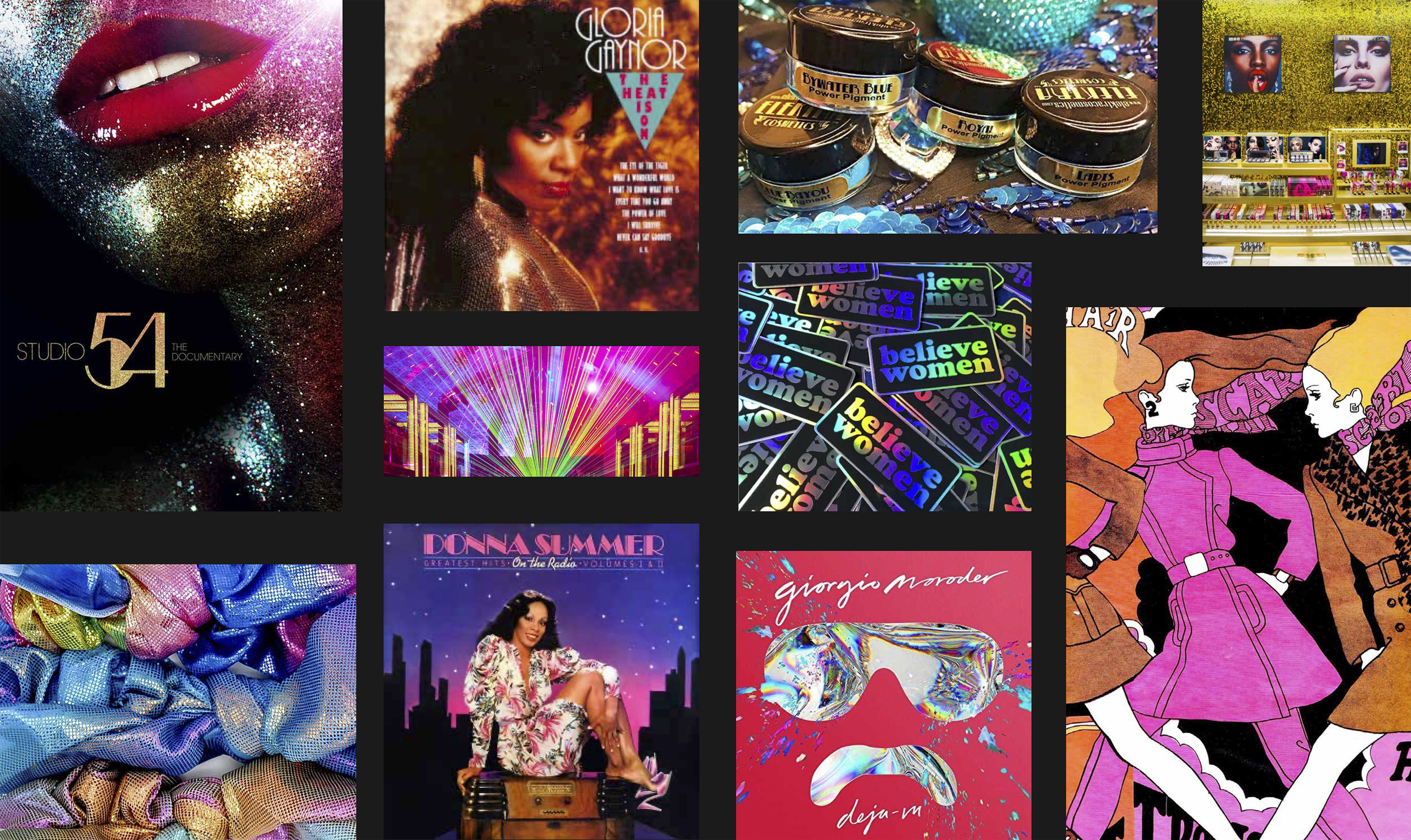
It needed to feel like Studio 54 never closed.
From the beginning, Tottie Pops was all about glitz, glam, color, and feeling sexy. As I got to know Kwajylnn, I knew she was a 70s disco girl–it reflected her entire style and business. This led me to study 70s/80s disco and counterculture, focusing on the clubbing scene.
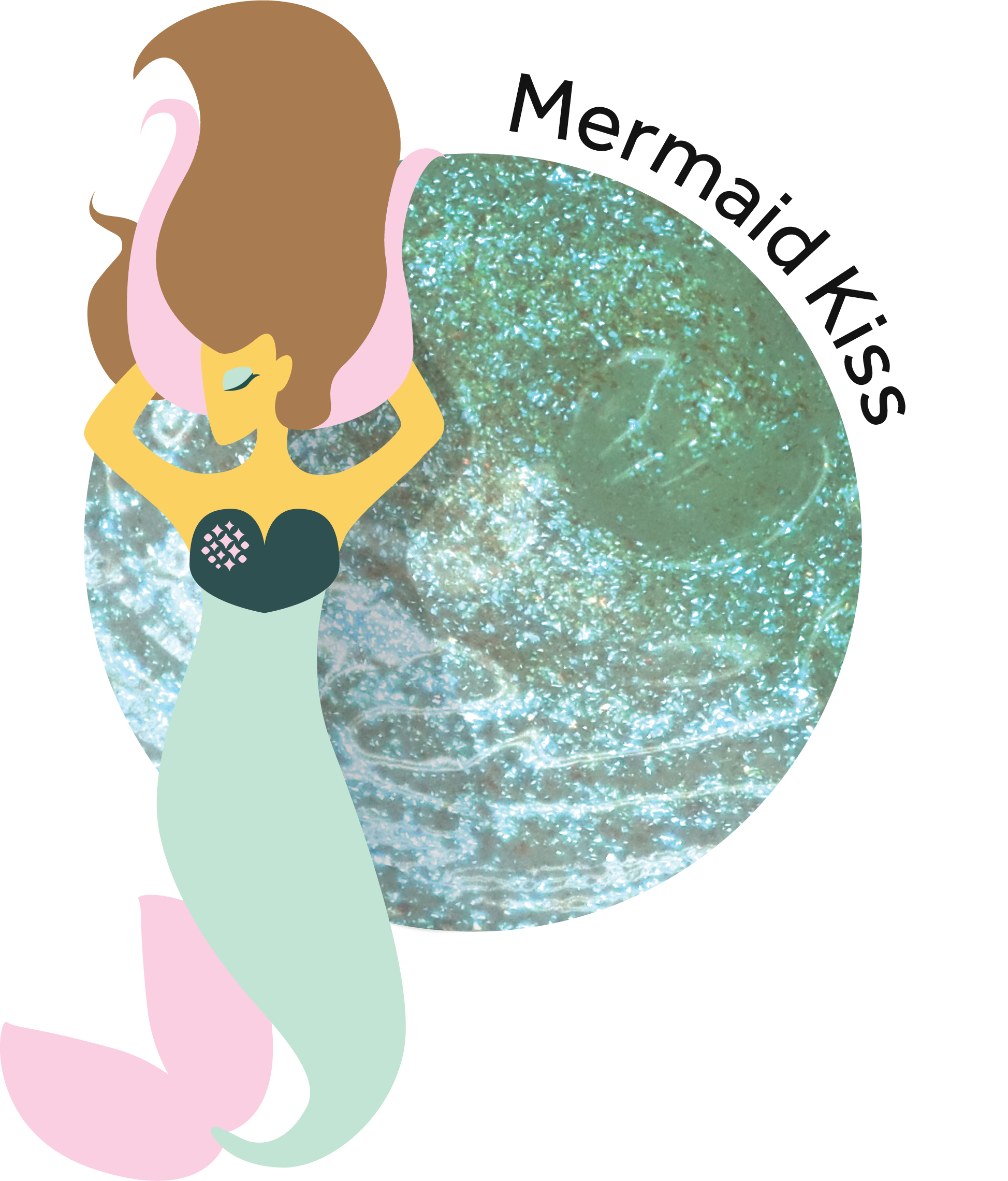
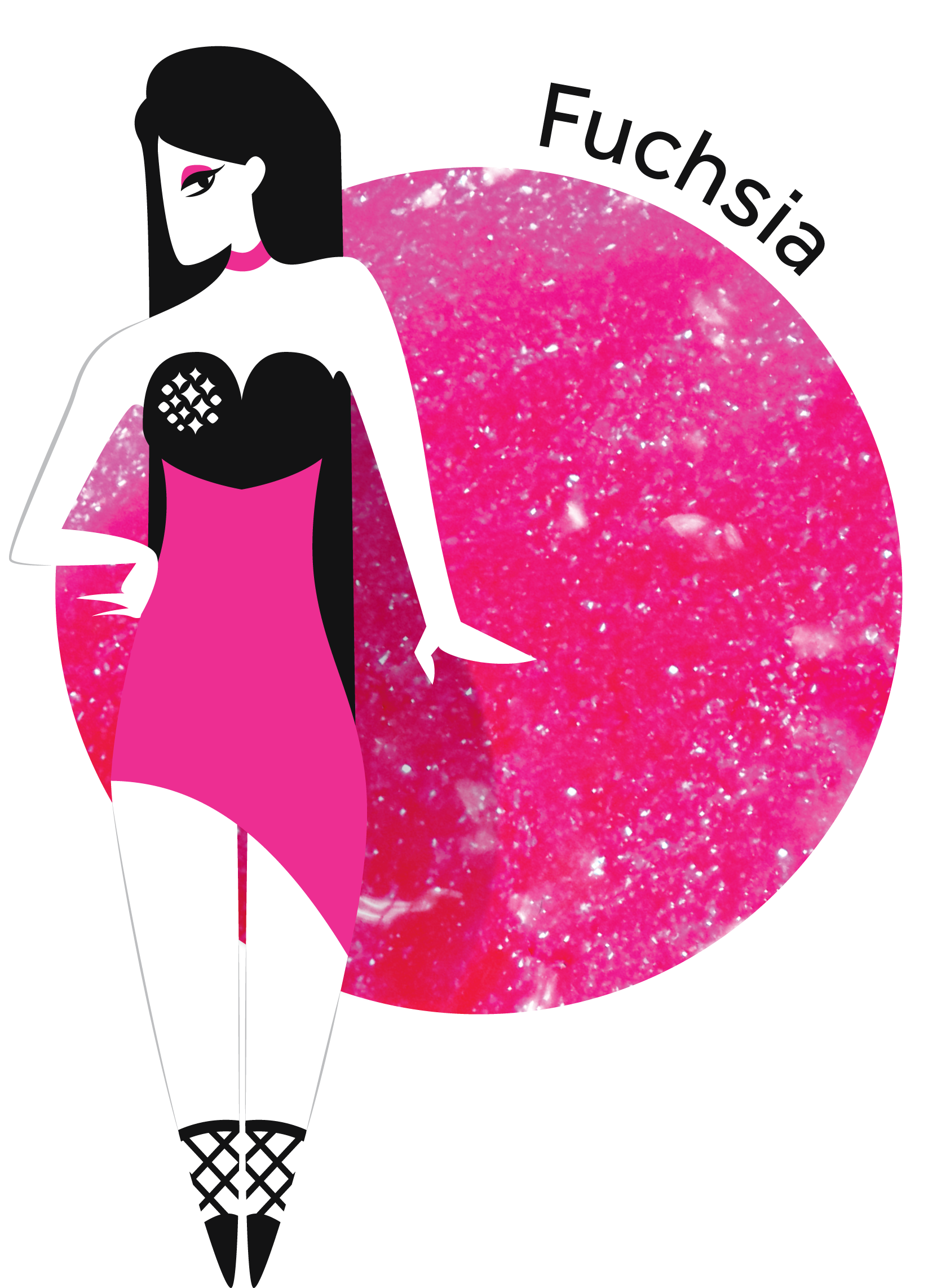
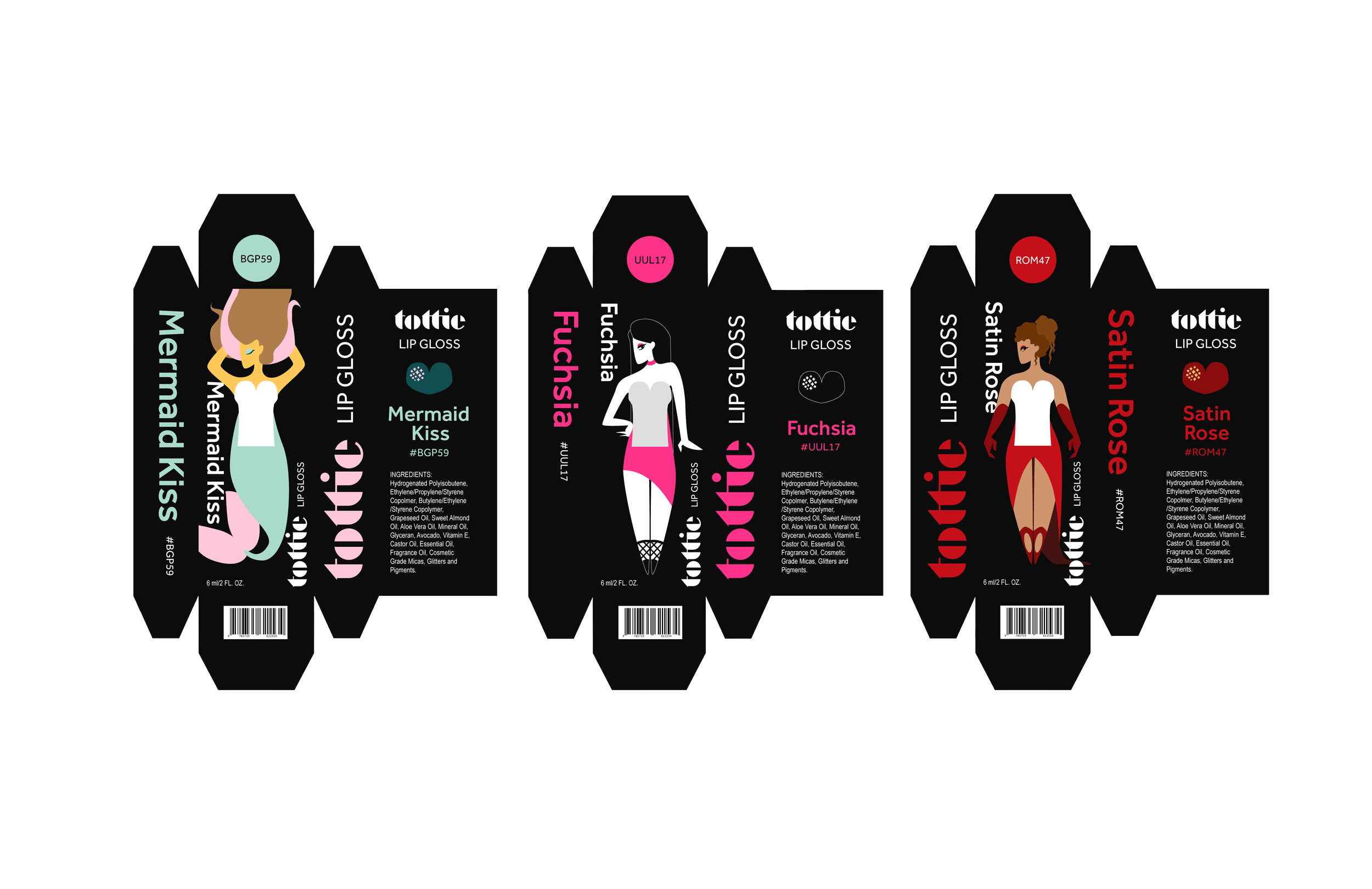
The logo aims to capture this time period in a bottle, with a heart that doubles as sparkling lips. Tottie Pops, now “Tottie", needed to balance maturity and sexual undertones with the the playfulness of the brand’s mission.


But what about all the different gloss colors?
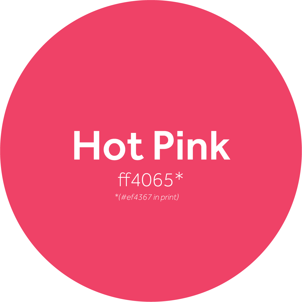
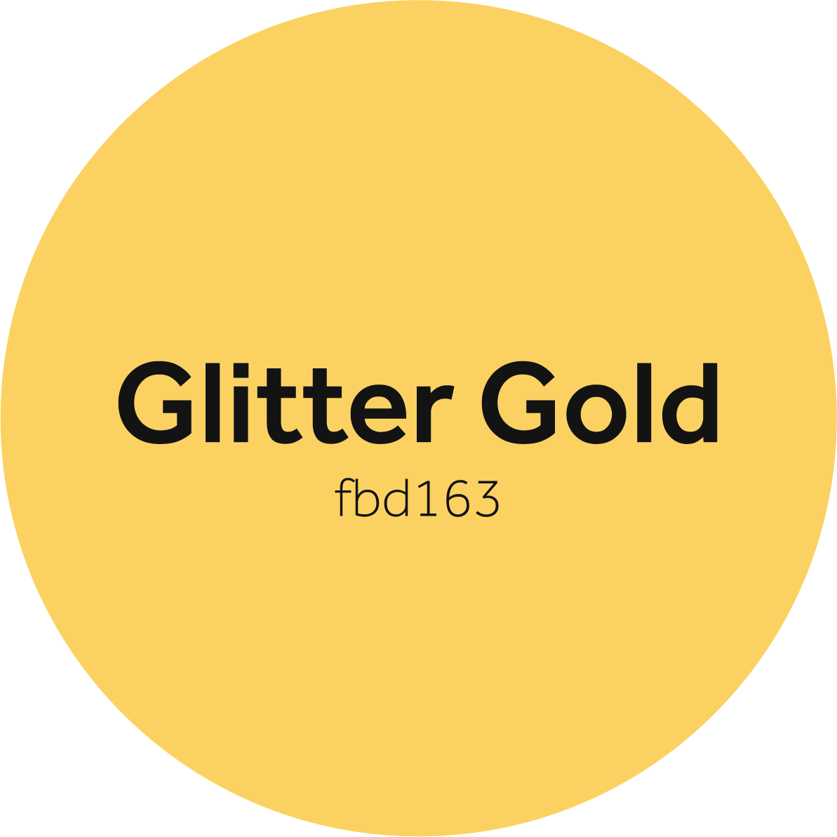
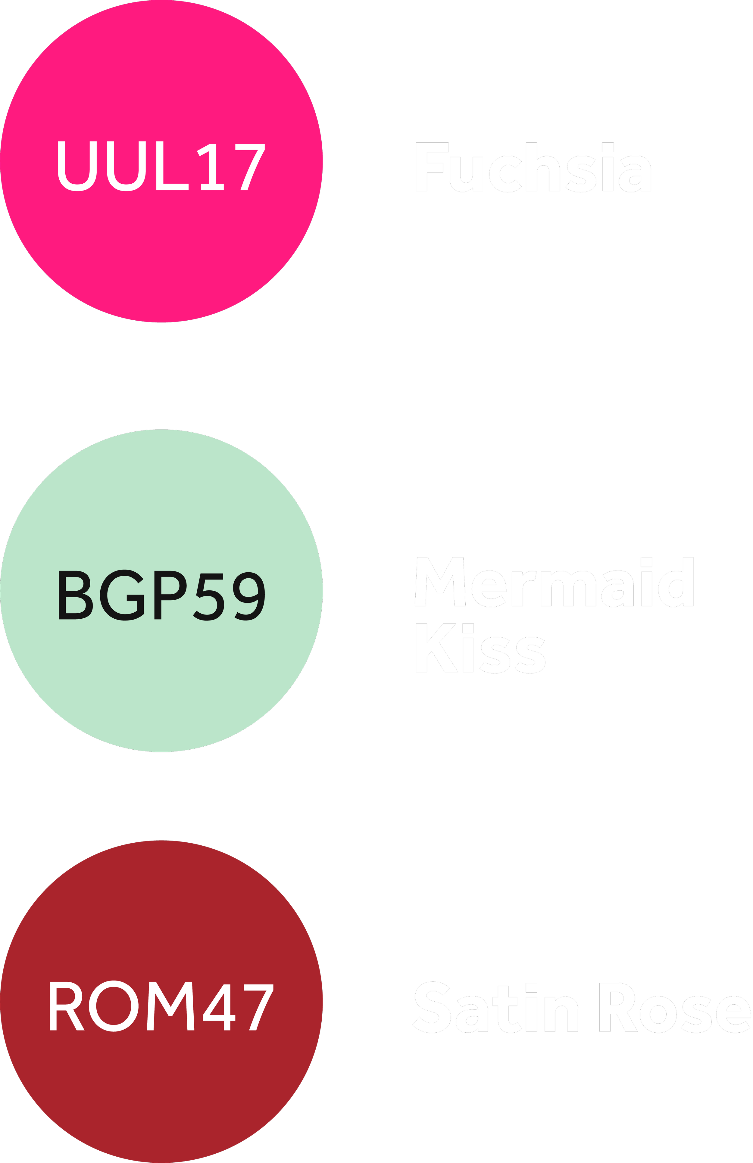
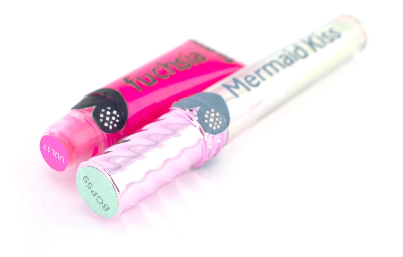
The main palette could represent Tottie as a whole, but these colors wouldn’t be appropriate for individual tubes, which span the full spectrum. How could this be systemized? I started by working with three different lab samples and giving them their own names:
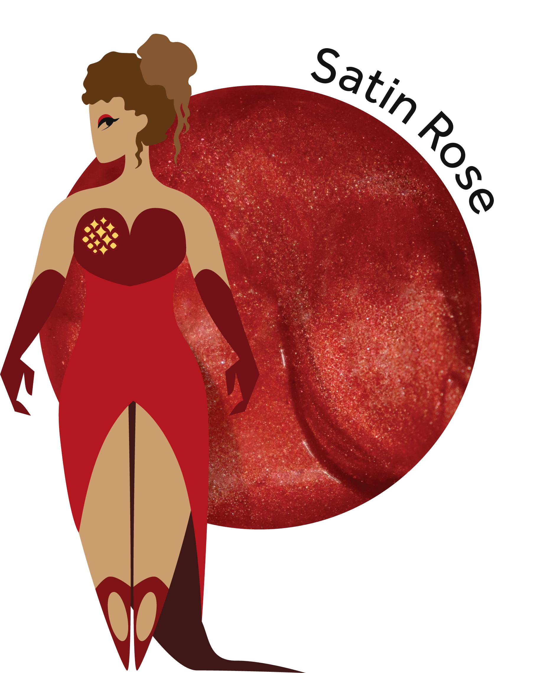
From there, I developed a color labeling system allowing any shade of gloss to have its own “hex code,” so customers could easily search their favorite colors.


Wrapping it up (in prototypes)
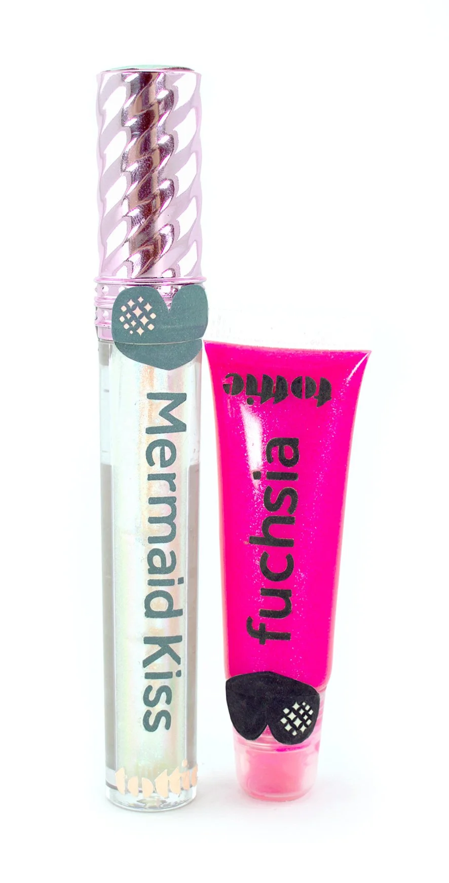
As the #1 customer touchpoint, I knew packaging couldn’t be ignored. With nothing but shipping label paper and hope, I tested ways to make standard-shaped (i.e, cheap to source) packages stand out with this new brand.
I took the ambient approach: The heart symbol could be applied onto the cusp of the tubes, so that they looked like parting lips when opened. The boxes transformed the tubes into busts, and shipped orders would have mailers decorated to look like makeup pouches.


I felt incredibly lucky to have had this opportunity, and I wish Kwajylynn well on her business ventures.