PACKAGING / BRANDING / PHOTOGRAPHY
Fun fact: All of these bottles were sold a few hours after being photographed!
Fat Cat Syrups was born in a Weiser Hall classroom, where the infamous UMich class “Entrepreneurial Creativity” was being held one odd winter semester.
The challenge:
Start a business in twelve weeks.
…seems easy enough, right?
riiiiiight?
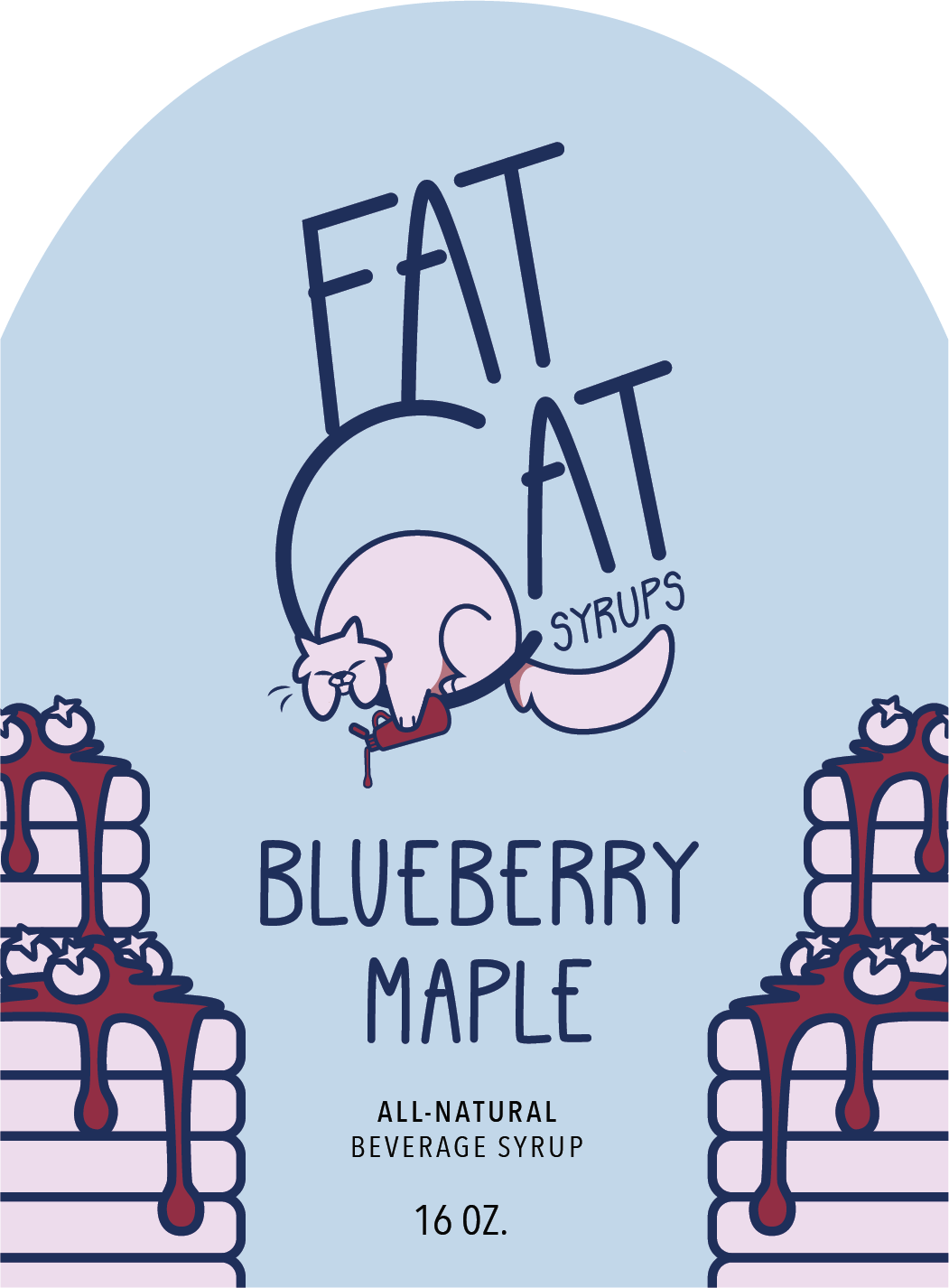
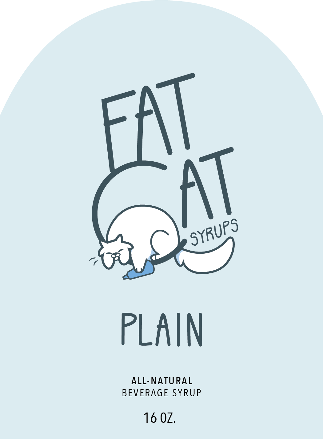
My job on the team was to handle all things visual design. Our product was beverage flavoring syrups for coffee, mixers, etc. In deciding a name for our venture, the sleepy balloon-shaped cat instantly stole our hearts.
A name like Fat Cat, of course, called for an indulgent brand.
The name “Fat Cat” had originated as an in-joke between my team members, and I wanted to capture that friendship and heartiness in the visuals. The focus was less on a “default brand” and more on how it manifested in each flavor.
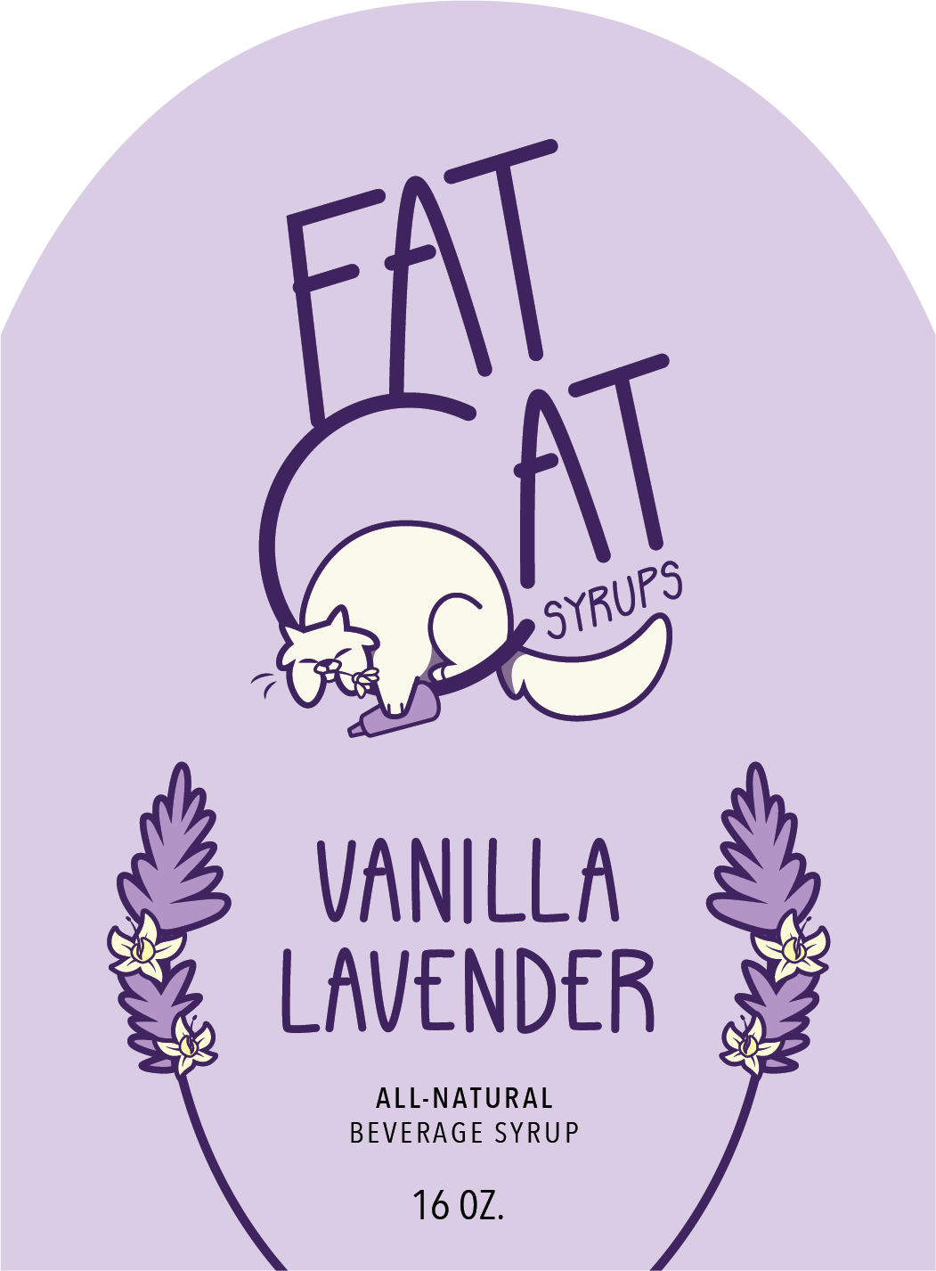
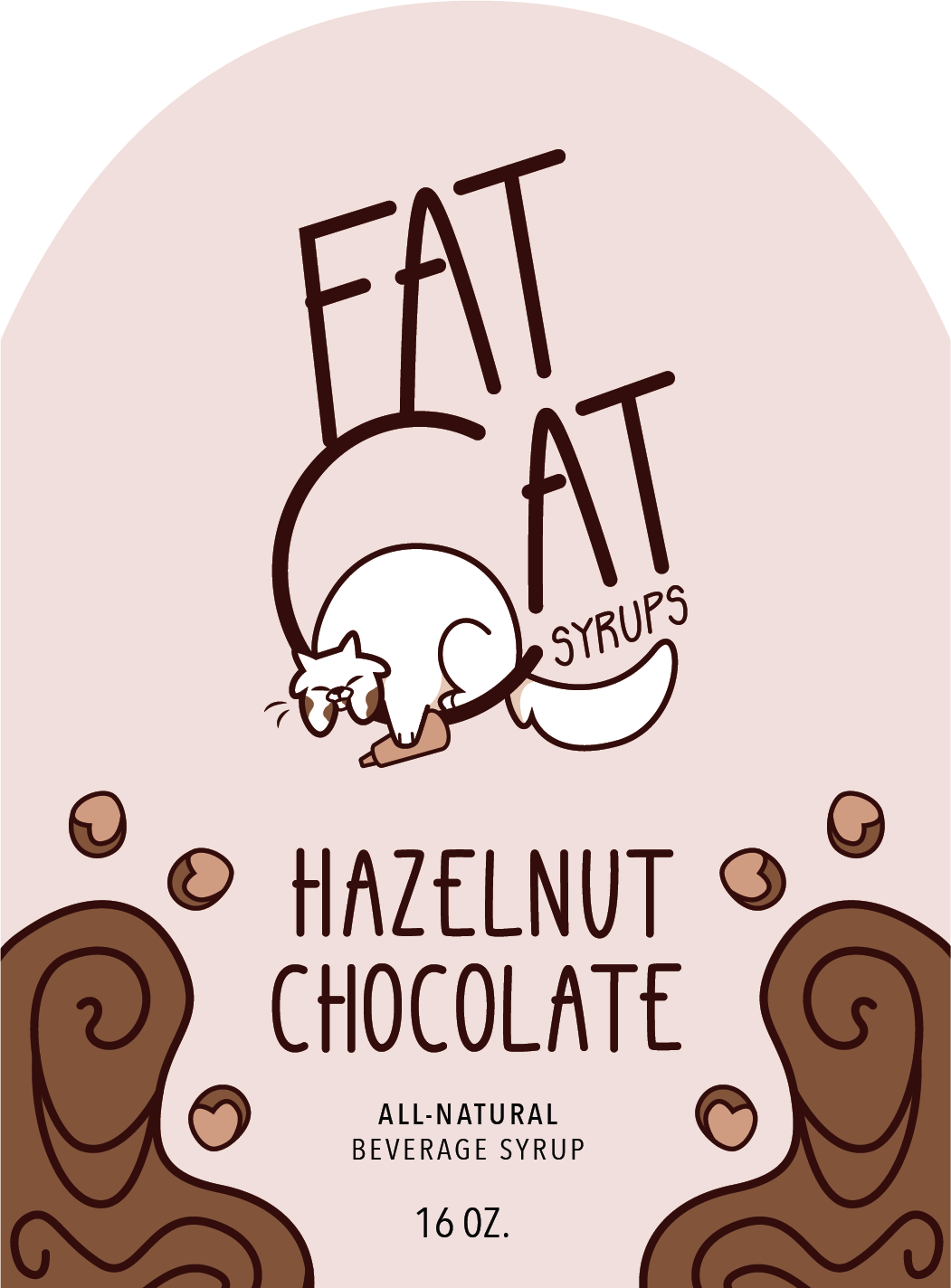
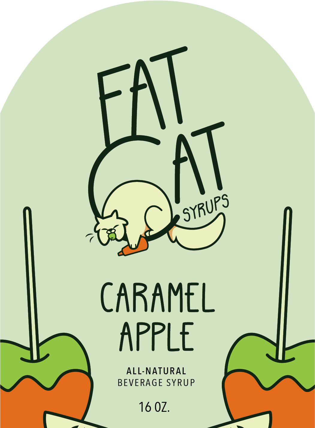
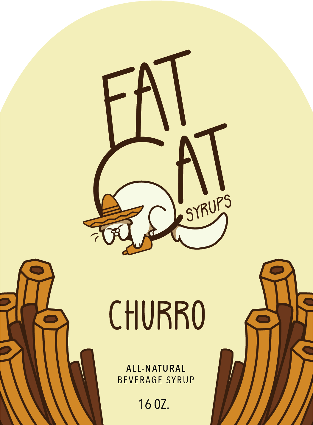
And then… the printing started.
Each bottle label was hand-printed from my very own studio, and then I applied each label by hand. “Inventory nights” went a little something like this:
But Fat Cat Syrups became a success with students on campus, many of whom citing the label design as the thing that drew them to our product.
We sold our entire inventory and made back all of our investments by the last day.
(And we were one of the top ranked teams in the class. But money is probably more important.)
When I arrived at the studio first thing in the morning, the photo room was originally locked. So, I improvised a few shots on the white coffee tables in the hallways (and tried not to cry just yet).

